Red in clothes: what you need to know?
Red is one of the brightest colours. No wonder the red clothes immediately attract attention to you. Perhaps, that is why many girls avoid choosing red outfits: it seems that such a self-sufficient colour is very difficult to combine with other colours and shades. In fact, wearing red things isn’t as difficult as it seems. We will give a few rules that will help you to learn how to wear red and combine it with other colours.
The psychology of red
It is widely known that colour directly affects our mood and even our physical condition. So, how do we perceive the red colour? In psychology, red symbolizes love, passion and energy, as well as sexuality. This is a very active and even aggressive colour. At the same time, it is the colour of danger, it attracts our attention and warns. Excess red colour leads to short temper and irritability. But its lack leads to fatigue and apathy. If you have a lot of red things in your wardrobe, then perhaps you can be described as a brave, purposeful, but rather hot-tempered person who likes to be in the centre of attention and lead the process. In the event that you consciously or intuitively avoid red colour, psychologists can say that you don’t like to attract too much attention to yourself, you are calm, but maybe a little unsure of yourself.
It turns out that the excess or lack of red colour can negatively affect our mood. Therefore, in choosing things, try to stick to the Golden mean. How exactly? We will tell you about the most correct colour combinations.
Trendy shades
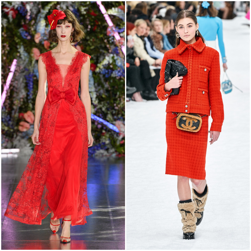
 Valentino spring-summer 2020, Louis Vuitton spring-summer 2020, Louis Vuitton spring-summer 2020
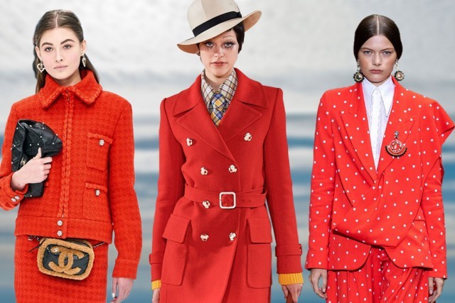
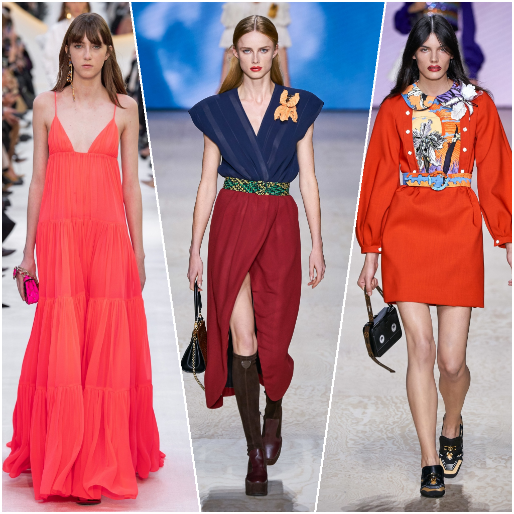
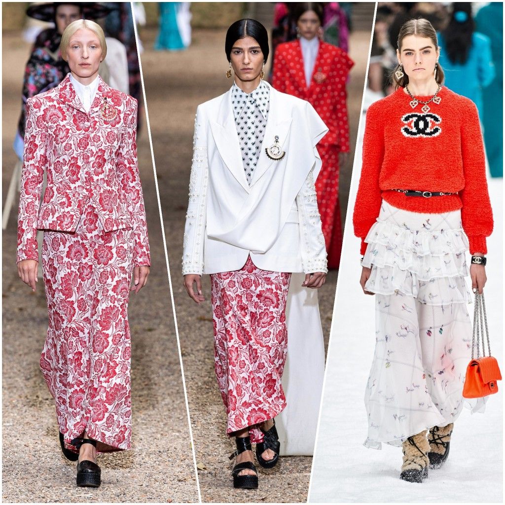
Pantone colour Institute called “Flame Scarlett” the most fashionable shade of red for this fall. But we recommend not to limit your choice to only one shade, especially since there are a huge number of different tones of this colour, which are suitable for different types of appearance. It is ruby, coral, dark red, crimson, fire, burgundy and many others. That is why you shouldn’t avoid this colour in your wardrobe: if you are afraid to stand out too much, then pick a darker shade of red. Look through the photos, how different shades of red look: among all its diversity, everyone can choose what will suit it.
 Rodarte autumn-winter 2019, Chanel autumn-winter 2019
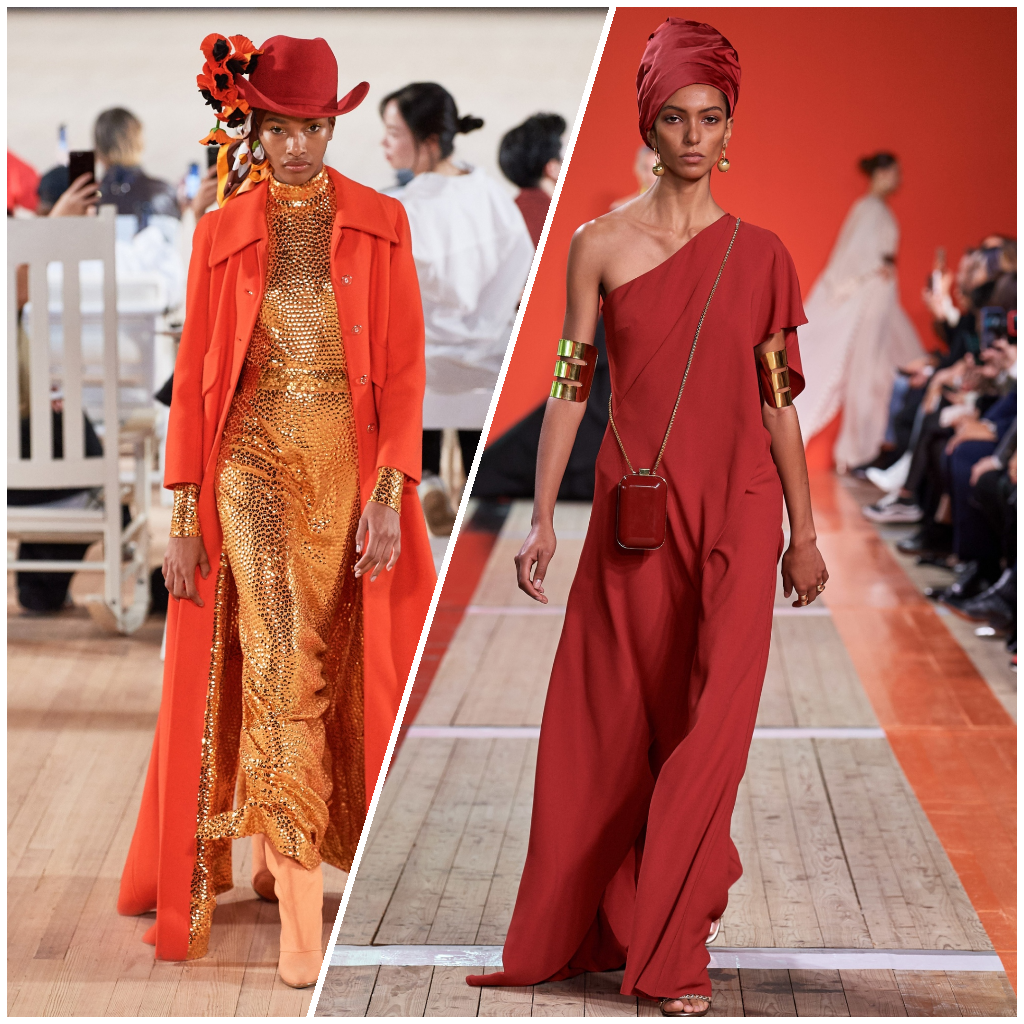
We don’t recommend your image to consist entirely of one shade of red: it is too active. So it needs to be diluted with other colours. For example, if you chose a red dress, then pick up a jacket of neutral colour, a white handbag, a belt or shoes of a calmer colour. So your image won’t look too aggressive. Compare these two photos: on one of them the red colour dominates, on the second-red is complemented by calmer colours. Which one do you think looks more organic?
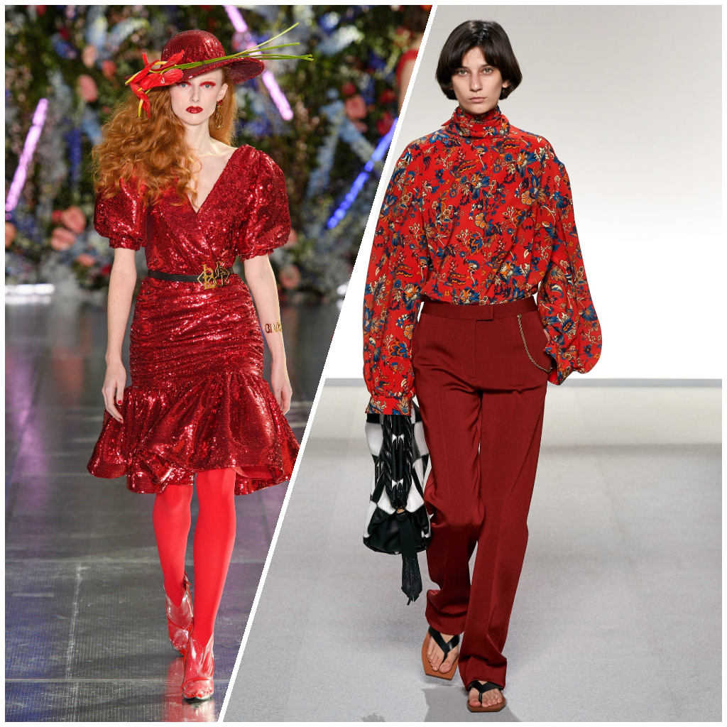 Rodarte autumn-winter 2019, Givenchy spring-summer 2020
Trendy life hack: designers advise to mute a bright and active shade in a darker tone. The most successful example is the image of Givenchy, in which a bright red blouse is successfully complemented by Burgundy trousers.
Trendy colour combinations 2019\2020
Red + black
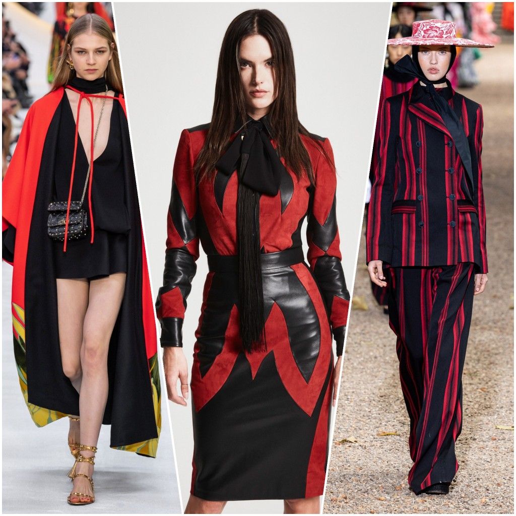 Valentino spring-summer 2020, Dundas autumn-winter 2019, Dundas spring-summer 2020
A win-win option for those who are afraid of too active red. Black colour mutes red shades, due to which the image ceases to be too pretentious. And, on the contrary, at the expense of red inserts the black suit ceases to seem gloomy: it is an example of an ideal combination of colours when shortcomings of one colour strengthen advantages of another. As an example, an outfit from Valentino and two images from the Dundas brand.
Red + grey
 Marni autumn-winter 2019
Red combined with grey gives almost the same effect as combined with black. To calm and even boring colour Marni brand added crimson shade of red. As a result, we have interesting autumn images that you can take note.
Red + white
 Erdem spring-summer 2020, Erdem spring-summer 2020, Chanel autumn-winter 2020
The second most popular colour for combination with red is white. White colour can act as an addition to the red colour (an excellent example is the look from Chanel, in which a red jumper is combined with snow-white trousers), and a background for an ornament or pattern made in red shades (this technique was used by the Erdem brand to create their outfits).
Red + gold
 Marc Jacobs autumn winter 2019, Gucci autumn winter 2019
One of the brightest combinations in our selection: red and gold. Gold itself is a very active colour, but if you complement it with red, the image will be more harmonious, but associated with luxury, wealth, holiday. It is worth noting that gold accessories also perfectly complement outfits of all shades of red, as we see it on the example of Gucci.
Red plaid
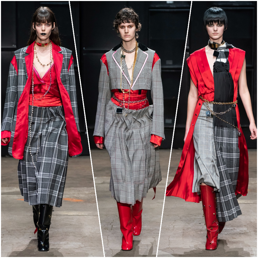
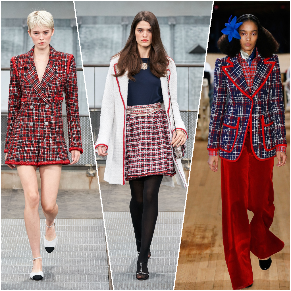 Chanel spring-summer 2020, Chanel spring-summer 2020, Marc Jacobs spring-summer 2020
Designers use another technique to muffle the expression of red: combine it with different colours in a plaid print. Notice how organically Chanel uses this combination. Only if you look closely, you can see that in some of these images, red is dominant – so well does the plaid pattern mask this catchy colour.
Red as an accent
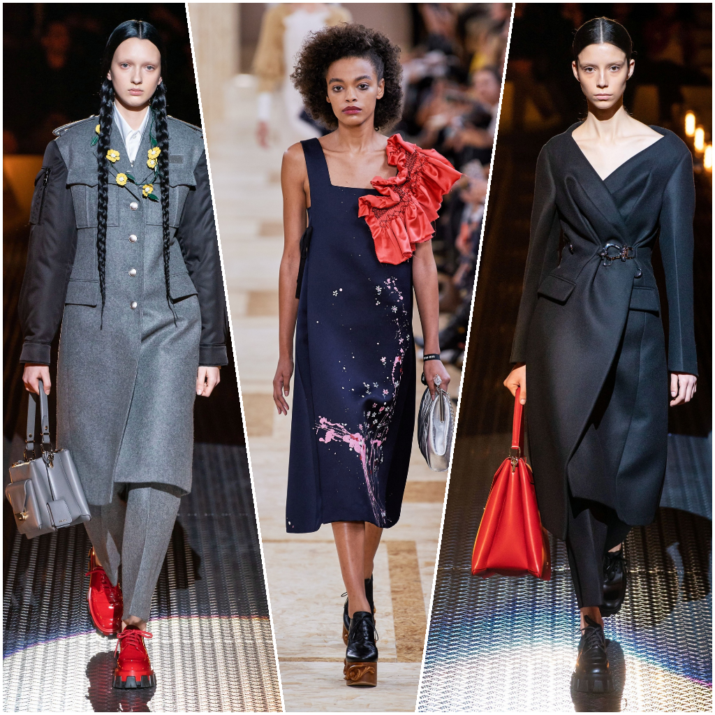 Prada spring-summer 2020, Miu Miu spring-summer 2020, Prada spring-summer 2020
If you are still afraid to use too much red in your wardrobe, try to pay attention to accessories or shoes in shades of red. These accents will allow you to spice up even the most gloomy way. This technique is suitable not only for spring-summer, but also for the autumn-winter season. Don’t be afraid to use red scarves, gloves, handbags or belts: they always look interesting and relevant, but your look won’t be so catchy.